|
First text
layer. Since the text tools (except the text mask ones) automatically
generate a new
layer it is a
good idea to first fill the original layer with the background colour
of the page (in this
case white) on
which the image is to be used. This makes it easier to see the
changes you do.
You can easily
hide the layer by clicking on the eye symbol on the left hand side of
the layer
palette.
• Open a
new work space (file) with the size of approximately 450x250 pixels
• Select
the Text tool and
click on the work space to bring up the text edit box
• Type in
the word SECURITY
•
Highlight the text and select the font Arial Black (if you don't have
it you can use another, e.g.
Impact), set
the font size to 40 and select a reddish colour (if you haven't done
that already).
• Click OK
You should now
have an image looking like this:

Create a new
text layer as described above, only this time type in the word
EQUIPMENT. The
font should be
Courier New (bold), the size 25 and the colour bluish. Position the
new text
underneath the
first text like this:

Highlight the
text (if it isn't) and set the character spacing (the middle box
below the font style
list box) to
415. Position the text, if necessary, and click OK. If everything
went well your
image should
now look like this:

Now it is time
for the company name. My thought is to place it diagonally above the SECURITY
text. How this
is done will be explained a little later.
To the company
name we will use a script font. Since Monotype Corsiva is quite
common that
will be the
one we use. Create a new text layer (as above) and type in the word Safeman's.
Set the size
to 50 pts.
Position the
text above the word SECURITY (note how the f drops below the base
line) like this:
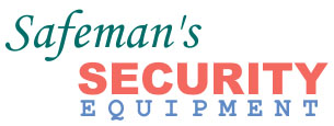
Then click OK |
